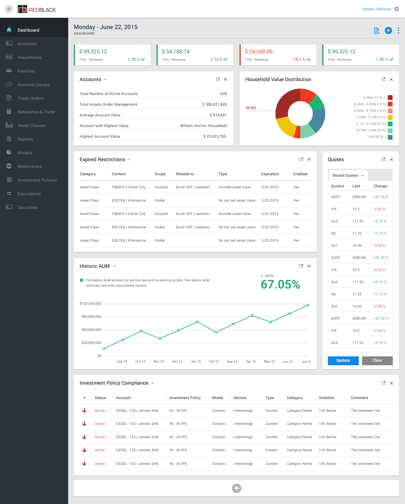
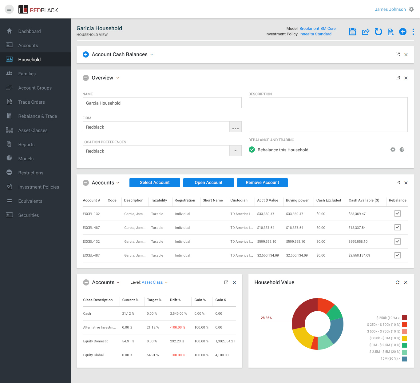
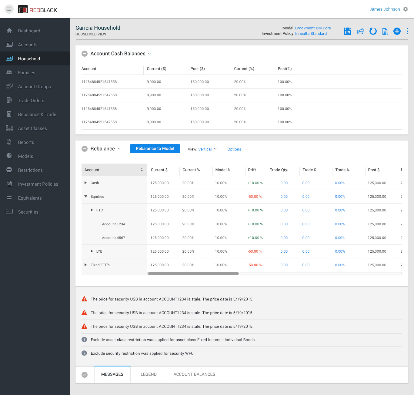
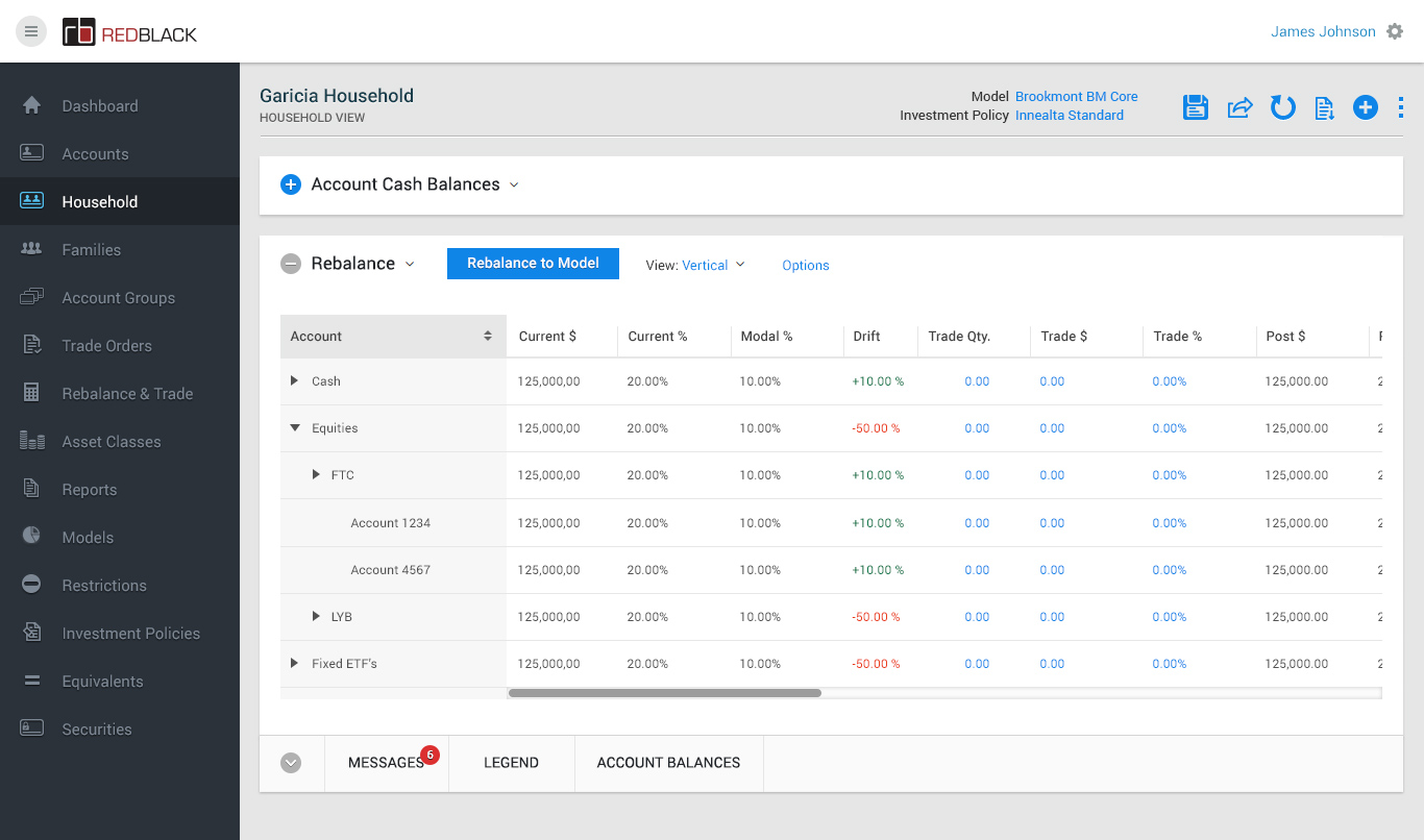
Rebalance Exp Dashboard
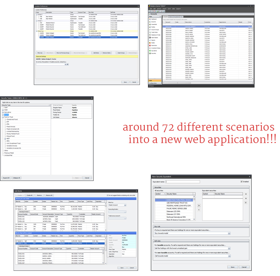
Web ApplicationThe toughest project ever - I had to learn all about a complete alien software, its users and have to convert that Desktop application to a Web application, that too in a very short time period.
The Overview
They are the independent market leader in investment management solutions for rebalancing, trading, order management, trade compliance and FIX integration. Their solutions are sought after by asset management firms, wealth managers, registered investment advisors, family offices, brokers, banks and trust companies.
Project Onboarding
We got a 2 days introduction about the product from the stake holders and their sales team. We came to know about their main purpose is to increase user base, reach more users and reduce the complication of onsite support. They already have a complex desktop application running successfully but lack user experience and proper user flow and design.
Start of Work
Our goal is to provide a design language that is unique and refined, it reflects the brand benefits, attributes and communicates clearly to the users the core values: intuitive, reliable, innovative and powerful.
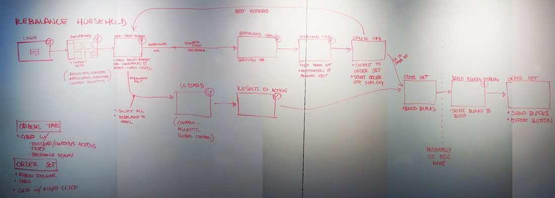
Luckily it was that time of the year in Seattle, the drizzling has stopped and the summer shining great. The design team use to sit and go through each and every requirements and pain points. We drew out a lot of flow charts and always ended up with more questions each time.
User Interviews
This project is focused on the Investment Advisor. An investment advisor is defined by the Securities and Exchange Commission as an individual or a firm that is in the business of giving advice about securities.
Luckily we had chance to meet some hardcore users as soon as the project got started, so we started formulating proper plans and user flows. We come to end our meetings with proper conclusions. Great and we straight away started information architecture and wire framing phase.
Persona Development
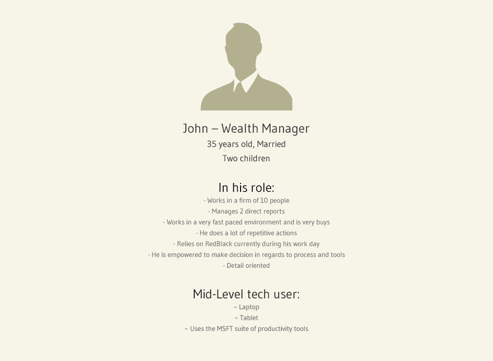
We created personas and identified problem statements. This was the foundation for the website's direction. It also gave us material for an idea generation session with the rest of the team.
Problem Statements
The problems were fleshed out into problem statements which in turns acted as requirements for the new website. The problems statements were divided into these 4 catergories
- - What needs do users want to fulfil by visiting the site?
- - What motivates users to come to the website?
- - What are the user's behaviours whilst fulfiling their needs?
- - What are the main pain points when users visit these type of sites?

The Workflow
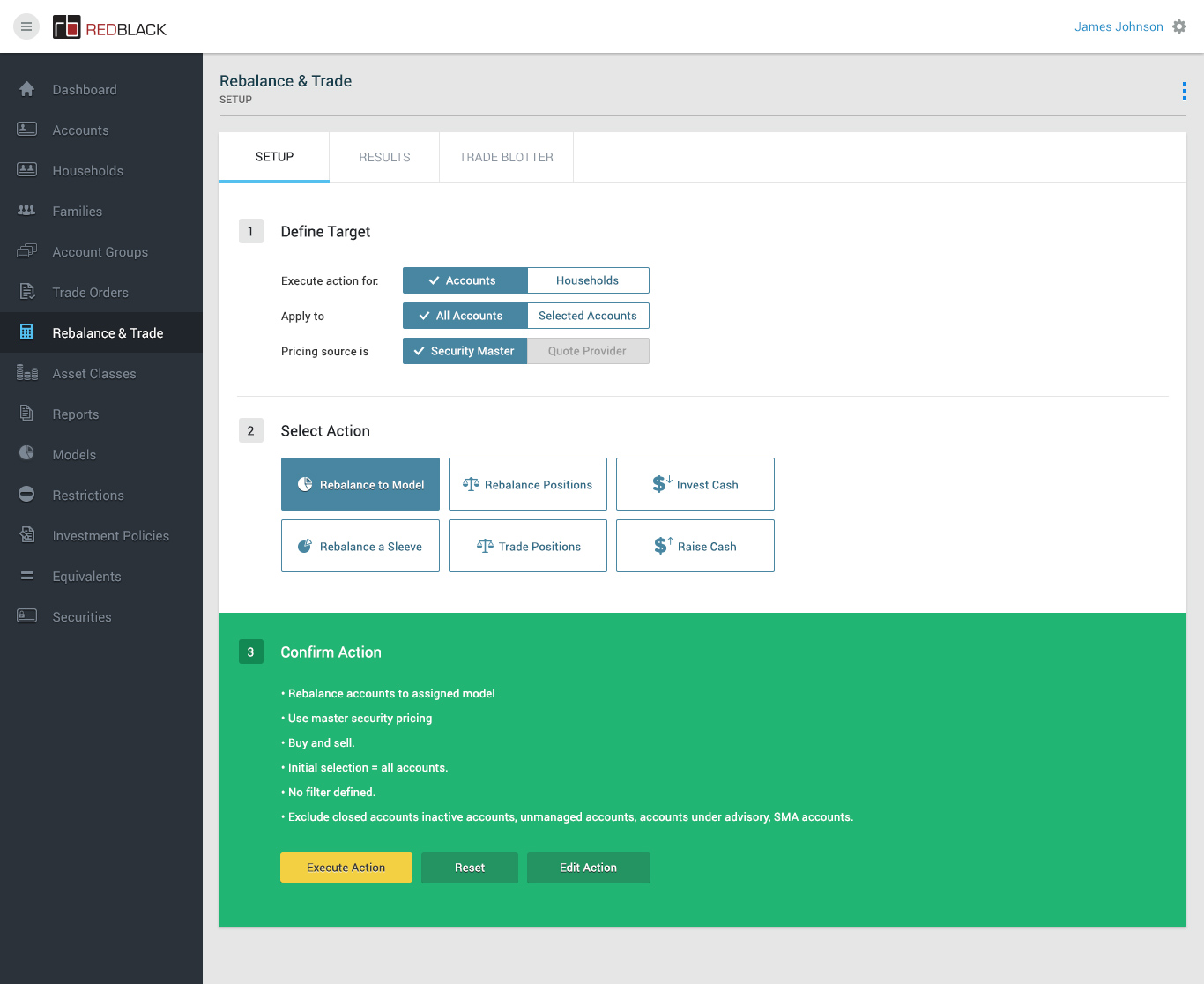
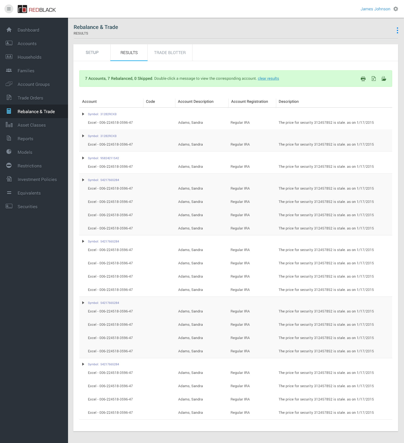
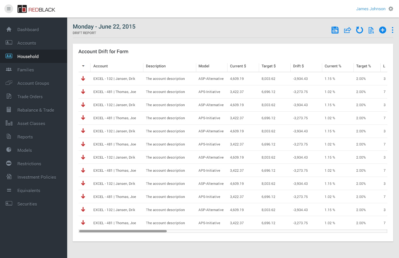
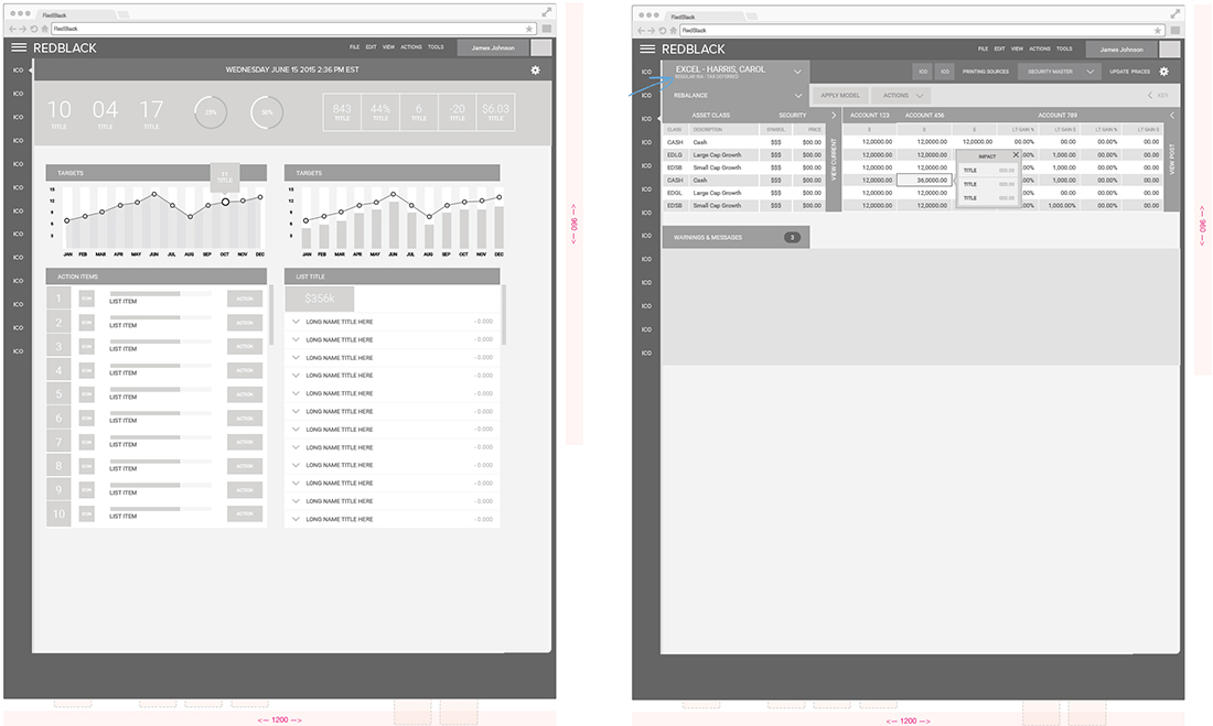
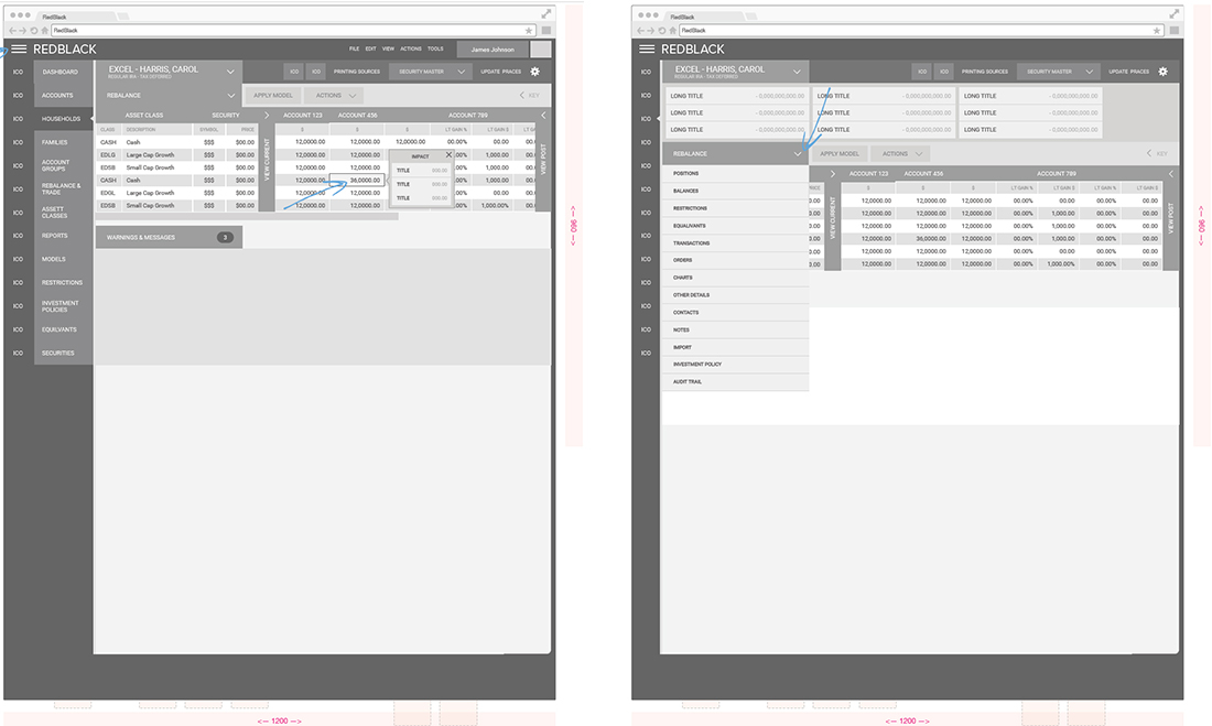
We identified a common taskflow to represent the Rebalancing process: rebalancing households that have drifted at the asset class level.
- - Rebalancing households one-by-one, with manual edits
- - Rebalancing all households to model via the Rebalance & Trade module
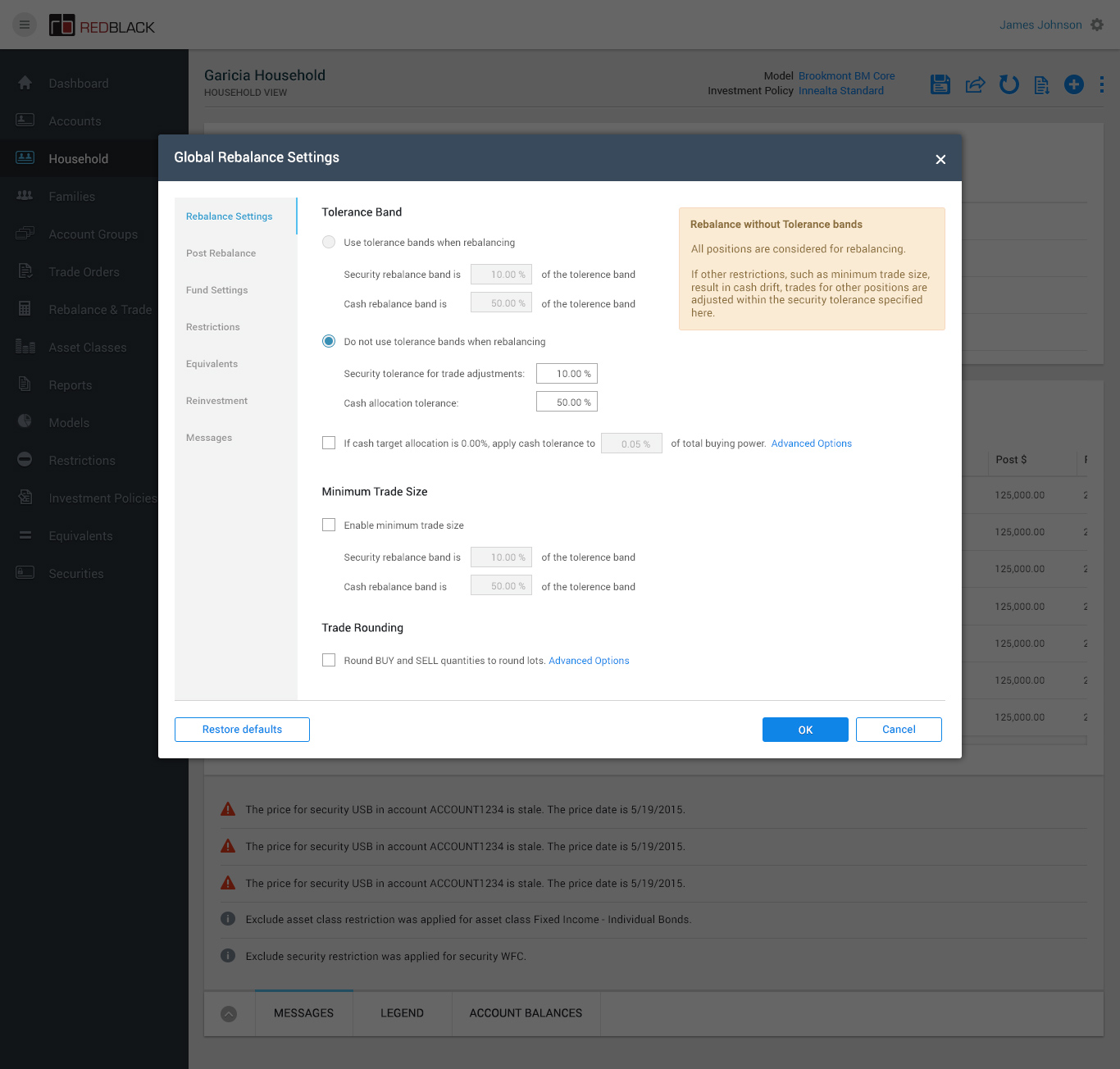
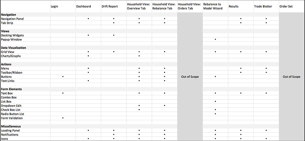
This workflow was chosen not only because it is a common task, but because it covers many of the key screens, interactions, controls and UI elements throughout the entire app. Many of these elements are quite complex, so solving this workflow early on will greatly benefit the project.
This workflow covers a great deal of interaction paradigms and controls, as shown in the table below.
Wireframes
Defining the Brand
We took the initial brand visual language and looked at how we could enhance it.
Enhance Style Guide
We added a few colour shades to brand guidelines to make them more flexible. We still needed to define suitable secondary colour palette however we wanted to wait till later down the line when the site design was more defined.
Design Components
We took the enhanced visual language and started to explore by designing components, to give the stakeholders a feel for how the site could start to look.
Design UI
