Use of Metaphors
back to introductionPrinciple: Choose metaphors that will enable users to instantly grasp the finest details of the conceptual model
Good metaphors generate in the users’ minds a strong series of connections to past experiences from the real world or from a previous cyberspace encounter, enabling users to form a fast and accurate sense of your system’s capabilities and limitations.
Principle: Bring metaphors “alive” by appealing to people’s perceptions–sight, sound, touch, and proprioception/kinesthesia – as well as triggering their memories
Try making your concepts visually apparent in the software itself. If that proves impractical, make it visual apparent through an illustration. The illustration should be compact and meaningful. Test it to see if it works, then embed it in such a way that every user that needs to see it will see it.
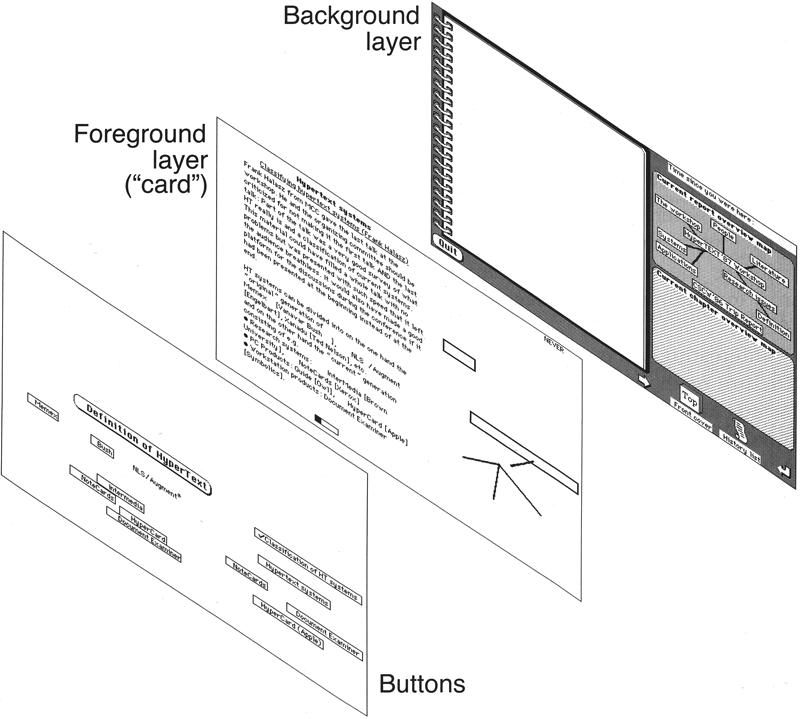
Case Study - Apple’s HyperCard browser:
This precursor to the web, had a three-layer structure, with a Background layer in common with all cards in a deck (equivalent to across all pages on a website), a Foreground “card” layer, with elements pertaining to an individual card (page), and a logical control layer for the individual card, with all the buttons, etc. If you didn’t understand this concept, you couldn’t author in Hypercard, and few understood it until the graphic designer, Kristee Kreitman, drew an exploded picture showing the three layers. When we tested that, everyone got it instantly. 20 pages of perfectly-accurate text drafted by its inventor? Nothing. One picture? Total success.
Principle: Expand beyond literal interpretation of real-world counterparts
Most metaphors evoke the familiar, but can and usually should add a new twist. For example, an electronic newspaper might bear a strong resemblance to a traditional paper, but with hyperlinks than enable users to quickly dive as far into articles as their interest drives them, something quite impossible with their paper counterparts. Not only is there no need to slavishly copy a real-world object (skeuomorphism), but unnecessarily limiting the functionality of a software counterpart just to “perfect” the imitation is most often bad design.
The inverse of skeuomorphism is abstraction, a prominent feature in so-called flat design, a fashion that took hold in 2013, turning once well-understood icons and other elements into meaningless abstractions and even false symbols. (For example, the icon for the browser on the iPhone became a compass, only connected to the concept of the web through the vaguest of abstractions. The iPhone has an actual compass, so they turned its icon into… another compass! Two compass icons: One tells you which way is north and the other connects you to your bank account. The Settings icon had originally looked like the inner workings of a clock, clearly carrying the message that this is an app that will let you see and affect the inside workings of the iPhone. That was abstracted to the point that it looks exactly like a large industrial fan.)
Principle: If a metaphor is holding you back, abandon it
A metaphor is intended to empower your user. However, there are times when it can also hold back your design.
Case Study: Dish Pointer Maps
DP Maps, as originally released in 2009 for the iPhone, used the time-honored map metaphor to enable people to aim TV satellite dishes.
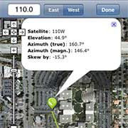
It would superimpose TV satellite aiming information, including the direction to the satellite (the green line) on Google mapping data. Sometimes location and direction were fairly easy to interpret as in this case, where the user is standing in the parking lot of 1 Infinite Loop, Apple’s then-current headquarters. With such a unique location, surrounded by distinct landmarks, locating what building the green line should just miss when aimed correctly was pretty simple. It was not so simple when the user was standing in a wooded area surrounded by tens of thousands of trees, all of which look remarkably alike when viewed from outer space. That map metaphor had been best the developer could do for the original desktop version, when installers would look at locations on their computers at their office before going out to worksites. The iPhone, however, offered a new opportunity.
A new pair of glasses
Often times, in reworking an old idea, you will want to “put on a new pair of glasses” as a way of looking at the old problem from an entirely different angle. In this case, my recommendation to the developer was that he do that quite literally, scrapping the map metaphor entirely in favor of giving people magical sight, so they could simply look up and see the communications satellites orbiting 22,000 miles in space. That’s exactly what he did:
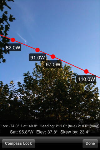
To use the replacement app, you walk around outside or scramble around on the roof until you can see the satellite(s) you need against clear sky without anything in the way. Mount the dish there, and you’re done. No map interpretation skills are needed.