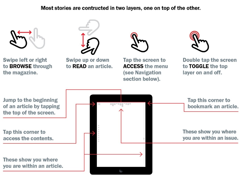
Discoverability
back to introductionDiscoverability, in design, refers to users' ability to find key information, applications or services. Discoverability allows users to locate something they need in order to complete a certain task. Discoverability is most often used to refer to what is noticeable to users on a particular Web page. Discoverability is a challenge for designers because it can be difficult to prioritize discoverability, as not everything can be be equally visible.
Principle: Any attempt to hide complexity will serve to increase it
Functional software does not have to look like a tractor; it can look like a Porsche. It cannot, however, look like a Porsche that’s missing its steering wheel, brake, and accelerator pedal. Yet many tech companies in the late 1990s began purposely hiding their most basic controls, often to the serious detriment of their users. Why? Because they found it more important to generate the Illusion of Simplicity for potential buyers than to reveal the extent of complexity to their actual users.
Businesses are driven to hide complexity from buyers because it can pay off in the short term: Most consumers who are potential buyers make judgements as to whether they can conquer a new machine not by sitting down and spending a day trying to learn it, but by gazing at the screen for ten minutes while the salesperson gives a demo. Stripping away scroll bars, hiding buttons, doing all the things that this section tells you not to do can all lead to increased profits, at least in the short term.
Case Study: The Invisible Mac Scroll Bars
Scroll bars are used to generate information, as a user clicks or drags within them to inform the software that the user wishes to move to a different position within the page or document. However, just as often, users will glance at the scroll bar just to see where they are in a page.Users try to maintain a sense of place on two different levels: First, their location right now within the visible part of the page; second, their location within the entire document. By forcing the user to move the mouse away from their current center of interest in order to scrub the scroll bar to make it appear, they lose a primary cue as to their current position within the visible page, namely, the current location of the mouse pointer.
Making a complex control like the scroll bar invisible likewise slows the user attempting to actually scroll: With the scroll invisible, the user can’t predict where in the blank space hiding the control she should scrub in order to find herself over the “elevator” she will use to do the scrolling. Instead, she first has to scrub somewhere in the scroll bar (target one) and then slide up or down to the elevator (target 2). (See Fitts’s Law for why this is bad.) Let’s assume that extra step would only require one extra second, a very conservative estimate. One second lost X ten scrolls per day per person X 66 million Mac users (at the time of this writing) = 21 person-years of wasted life and productivity per day, all to make a screen in a store look simpler.
Principle: If you choose to hide complexity, do so in the showroom only
You need never decide whether to support potential buyers or eventual users. We are not working with fixed pieces of hardware. We work with either pure software or hardware driven by software. A designer can easily create a system that will fully support both buyer and user, switching appearance depending on current need. You can design the software for an operating system, for example, that will present itself in a very simple form in the store only to slowly open up like a flower, offering the user more and more accessibility and functionality as the user becomes progressively more skilled and more comfortable.
Crippling an interface might help make the initial sale, but in the long run, it can lead to having your most important “sales force,” your existing customer base, not only leave you, but tell your potential buyers to stay away as well.
Principle: If the user cannot find it, it does not exist
Not all buyers are naive. Even those that are don’t stay that way long. Only the most persistent buyers/users will travel the web searching for a treasure map to features that you choose to hide from them. Most will simply turn to your competitors, taking you at your word that you just don’t offer whatever they were after.
Case Study: Safari for the Mac
"I abandoned the Safari browser for Firefox after I found that Safari for the Mac had started corrupting PDF files when doing a Save As. Two years later, I tried Safari again, assuming Apple had by now fixed the bug. The bug persisted, but I persisted this time, too, spending 20 minutes Googling for a work-around. The solution I discovered? Never use Save As to save a PDF file. Instead, mouse away from the top of the display, where 100% of the file-manipulation controls are, toward the bottom of the window, where nothing but content exists. Suddenly, a gray box with a floppy-disk icon will start fading into view inside the content region. Click the icon, and Safari will save your PDF."
Bruce “Tog” Tognazzini
Use Active Discovery to guide people to more advanced features
With Active Discovery, you cease waiting for people to find something and, instead, offer it to them. In its ideal form, your system “realizes” they now need it and offers it to them. In most instances, we are far from being able to do that. A workable compromise:
1. Mention to a user that a feature exists about the earliest he might need it
2. Repeat the message at intelligently spaced intervals. Not over and over again.
3. Stop mentioning it once either explored or adopted
The messaging might take the form of a “Did you know…” hint that you show during startup. (If you see a large percentage of your users are turning off these hints, it reflects that you are prematurely mentioning features, are giving them too many hints too often, or continue to tell them about features they have adopted. It is not necessary to give a helpful hint each and every time the user starts up your app. They are more likely to be read and appreciated if they occur on occasion.
Case Study: GroceryIQ app for the iPhone
GroceryIQ enabled the user to scan the bar codes of rapidly-emptying containers in the user’s kitchen or to type in a few leading words to any product they might find in a grocery store. Armed with the resulting list, they could walk through their neighbourhood market, marking off items as they came across them. It was quick, efficient, and, in general, designed competently. The developers had made no effort to hide complexity. However, the user could make good use of the app within a couple minutes, discovering further complexity when and if their wants and needs expanded.GroceryIQ had no real competition in this rather narrow sector for several years. When a new app was released that also enabled the user to sync between devices, so that, for example, a wife could enter an item, such as a quart of milk, and it would show up in the husband’s shopping list a few seconds later, many people jumped ship, moving to the new product.So why is this a case study of interest? Because GroceryIQ had had syncing between products for more than five years before the competing product was released. It was easy to set up and very reliable. It was not purposely hidden and its name, Sync, certainly was not open to misinterpretation. The problem was that it was on the More… submenu, rather than being constantly displayed at the bottom of the phone. An Active Discovery reminder, triggered on opening perhaps a few days after the app was installed, along with a follow-up even every three months thereafter until such time as Sync was set up would have prevented a loss of customers five years later when the new app, “featuring Sync!” showed up.
Principle: Controls and other objects necessary for the successful use of software should be visibly accessible at all times
The object itself should either be view or enclosed by an object or series of objects (documents within folders, menu items within a menu, for example) that, in turn, are visibly accessible at all times.
Exceptions can be made for systems that are used habitually, such as a mobile browser or reader, where:
1. Screen size is so limited that it is impractical to display items not currently needed, and
2. It would be difficult or impossible for the user to fail to trigger the appearance of the controls by accident, thus ensuring the user will discover their existence.
These exceptions cover standard and widely-used operating system objects and behaviours on mobile devices, as long as users are given simple and obvious access to a help guide for using them.
Principle: There is no “elegance” exception to discoverability
A few designers, having fallen in love with the clean lines of smartphone apps, thought it would be great to visit those same clean lines on giant-screen computers. Wrong! Hiding functionality to create the Illusion of Simplicity is an approach that saps user-efficiency and makes products an easy target for competitors.
Principle: With the exception of small mobile devices, controls do not belong in the middle of the content area
Smartphone and tablet controls are sometimes forced into the content area because the screens are so small, that’s the only area there is. Even there, you need to provide a standard trigger, such as a tap in the middle of the content area, that will simultaneously expose all the icons and buttons representing all the hidden controls so that users don’t have to carry out a treasure hunt.
Web Pages & Cloud-based Applications
The first “inside-out” applications appeared inside web browsers as independent developers struggled to create complex sites and apps within the confines of a simple window in a simple tool designed for simple browsing of static pages. Even though the basic paradigm was shown inadequate by 1996, nothing at all has been done by standards committees to address the needs of these developers.
Developers working on complex sites and cloud-based web applications deserve access to the browser’s menu bar. That they don’t already have it is a continuing scandal. Imagine your boss telling you to whip up a competitor to Photoshop that uses Microsoft Word’s menu bar. The first words out of your mouth would be, “but that would mean I’d have to put all my menus in the content area of the window where the user’s image needs to be!” Insane, right? Yet that’s just what we do every time we create a web page.
On laptop and desktop computers, controls, and, in particular, hidden controls have no place inside the content area.
Case Study: Apple’s Inverted Applications
Apple, as of the early 2010s, began migrating controls from the area surrounding the content region of their Macintosh applications into the content region itself. The controls popped up in locations that would obscure the very content the user was attempting to affect. The user was often unable to move the controls far enough out of the way to be able to see what they were doing. Even when a control panel could be moved beyond the edges of the content window, it would revert to its original obscuring position the next time it was invoked. While this approach was sometimes a necessity for apps designed for phones, it made no practical sense for apps designed for the large screens found on traditional computers. Some of the affected apps would take up as little as 10% or 20% of the user’s screen, providing huge amounts of room for the controls suddenly being forced into the even smaller content region. It resulted in serious degradation of the user’s satisfaction and productivity.
Principle: Communicate your gestural vocabulary with visual diagrams
Include a help page that shows the gestures your app can understand. Present the page when the user first opens the app and make it clear where the user will find this help page after that. In a mobile app, make the icon representing the page constantly visible or have it form part of the standard set that appears around the periphery when the user touches the triggering area of the mobile screen. For a magazines and similar media objects, make it the first open page (after the cover) of each and every issue, always there and available.
Principle: Strive for Balance
It is not 1980, when most people had never seen a computer, and we necessarily made everything highly visible. You can use subtly in design: Don’t put an info icon next to every single item on the page. Instead, use overlays like this one from Google+ Snapseed that explain every symbol and every gesture at once:
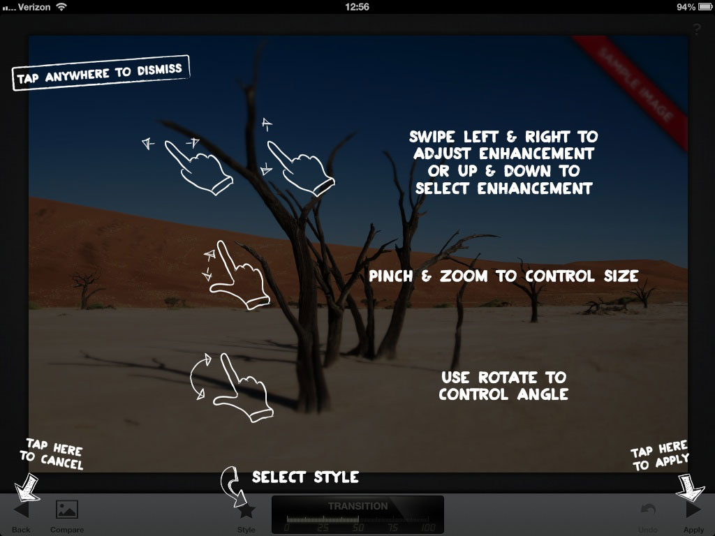
It is difficult to see with the overlay in place, but the developers have reinforced their Cancel and Apply arrows with permanent, written labels. How do you find out if such reinforcement is necessary? How do you find out whether the user can figure out what to press (in this case, an always-visible question mark at the extreme top right) to get help to begin with? Follow the next principle and apply the results.
Principle: User-test for discoverability
To discover what information you need to communicate and to ensure you’re successfully communicating it, you must do routine usability tests throughout a project. Test using a population that has your expected level of experience with the system and task domain. See if they can locate, identify, learn, and use the tools they need to perform the tasks you expect your users to perform. If they cannot, iterate the design until they can. Make use of Active Discovery, Dealer Modes, whatever you need to to ensure your users can discover and learn the features of your product.
Not one of the errors I’ve discussed above would ever make it into production were user-experience groups conducting usability studies and altering the design based on those results.
Further Reading
- The myth of discoverability - By: Scott Berkun
- The Evolution of Discoverability - By: UX Mag